Marketing Digital Website: Pages That Convert in 2026
02/08/2026
In 2026, a “marketing digital website” that converts is not the one with the most pages. It is the one where every page has a clear job, answers the right objections at the right time, and makes the next step feel safe, fast, and obvious.
For agencies and service providers (and the SaaS tools that sell to them), the bar is higher than it was even 18 months ago: buyers research with AI, compare you against screenshots and secondhand opinions, and expect instant clarity on security, implementation, and time-to-value.
Below is a conversion-first blueprint for the pages that consistently drive booked calls, trials, and qualified inbound in 2026.
What changed for conversion in 2026
1) Buyers arrive pre-educated (and more skeptical)
Prospects are reading summaries from AI search, scanning Reddit and communities, and using comparison lists before they ever hit your site. That means your pages need to:
- Confirm you are “the right category” in seconds
- Provide proof fast (not just claims)
- Remove risk (security, access, implementation, contracts)
2) Multi-stakeholder review is the default
Even small agency purchases often involve a second person: operations, finance, or a technical owner. Pages that convert in 2026 help a champion “sell it internally” by providing:
- Clear scope and outcomes
- Security and data handling details
- Integration and setup expectations
3) Speed-to-value is a differentiator
If you cannot explain how someone gets from “yes” to “working” quickly, you lose to vendors who can. This is where onboarding content (not just marketing copy) becomes a conversion asset.
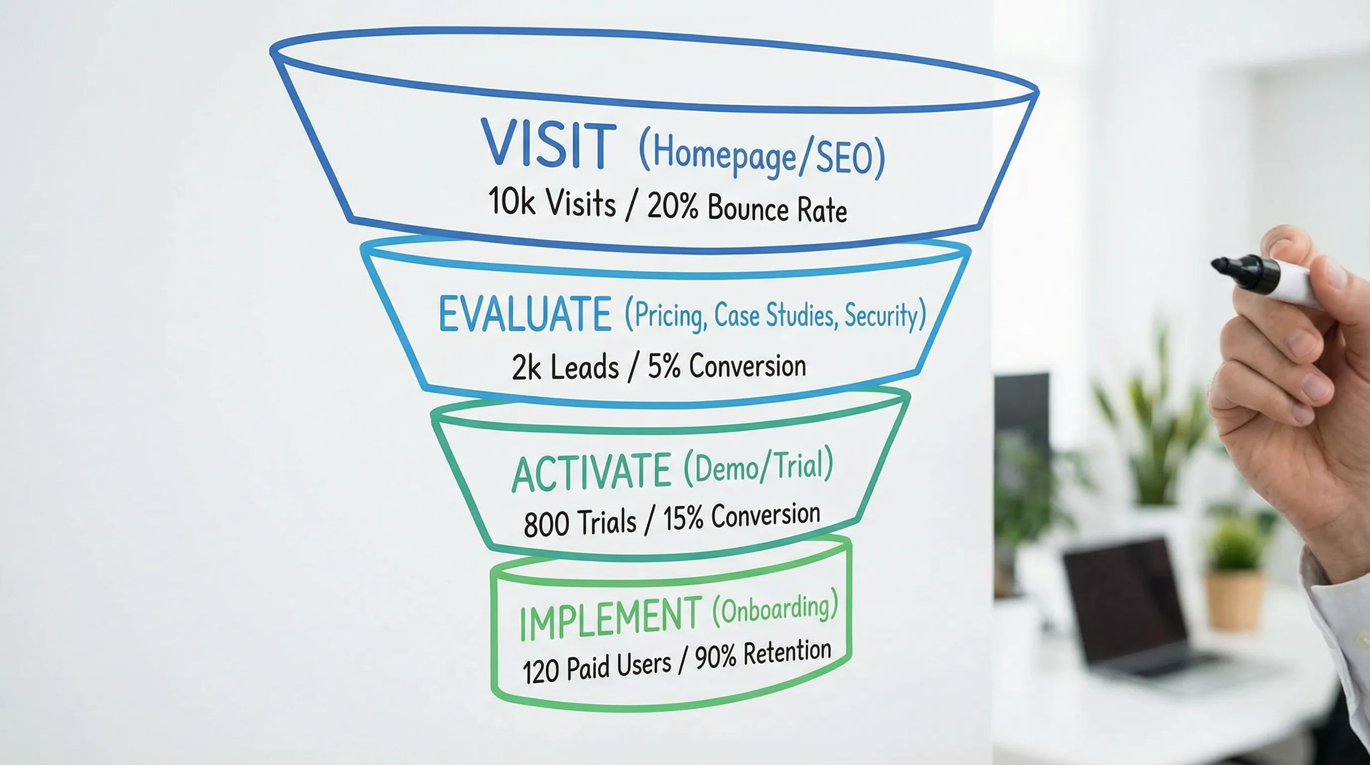
The 2026 conversion architecture (pages mapped to intent)
A high-converting site typically supports three journeys:
- Discover: “Is this for me?”
- Evaluate: “Is this credible, safe, and worth switching?”
- Activate: “Can I start quickly without headaches?”
Use this table to map pages to their conversion job.
| Page type | Primary conversion job | Best primary CTA in 2026 | Proof that moves the needle | What to measure |
|---|---|---|---|---|
| Homepage | Fast category clarity + routing | Book a demo, Start free trial | Logos, quantified outcomes, 1-2 short testimonials | Clicks on primary CTA, route selection, scroll depth |
| Solution / Product page | Explain “how it works” and why it is different | Book a demo | Workflow visuals, security notes, integration list | CTA clicks, section engagement |
| Use case page | Connect features to a real scenario | See the workflow, Book a demo | Before/after process, time saved, role mapping | CTA clicks, time on page |
| Pricing / Packaging | Remove cost uncertainty and qualify | Start free trial, Talk to sales | What’s included, who it’s for, risk reducers | Pricing page visits that lead to demo/trial |
| Demo page | Reduce friction to booking | Schedule demo | What happens on the call, agenda, FAQs | Form completion rate, drop-off fields |
| Case studies | Prove outcomes in context | Talk to sales | Baselines, constraints, implementation details | Case study to CTA conversion |
| Security / Trust | Remove stakeholder objections | Request security info, Book a demo | Data handling summary, access model, policies | Visits from pricing/demo, CTA assists |
| Integrations | Answer “will it work with our stack?” | View integrations, Book a demo | Platform coverage, API/webhooks mention | Clicks to integration docs, demo assists |
| Comparison | Win “vendor vs vendor” searches | See differences, Book a demo | Side-by-side criteria + fair limitations | Conversion rate, assisted conversions |
| Onboarding / Getting started | Prove speed-to-value | Start free trial | Step-by-step setup, time-to-live | Trial starts, activation rate |
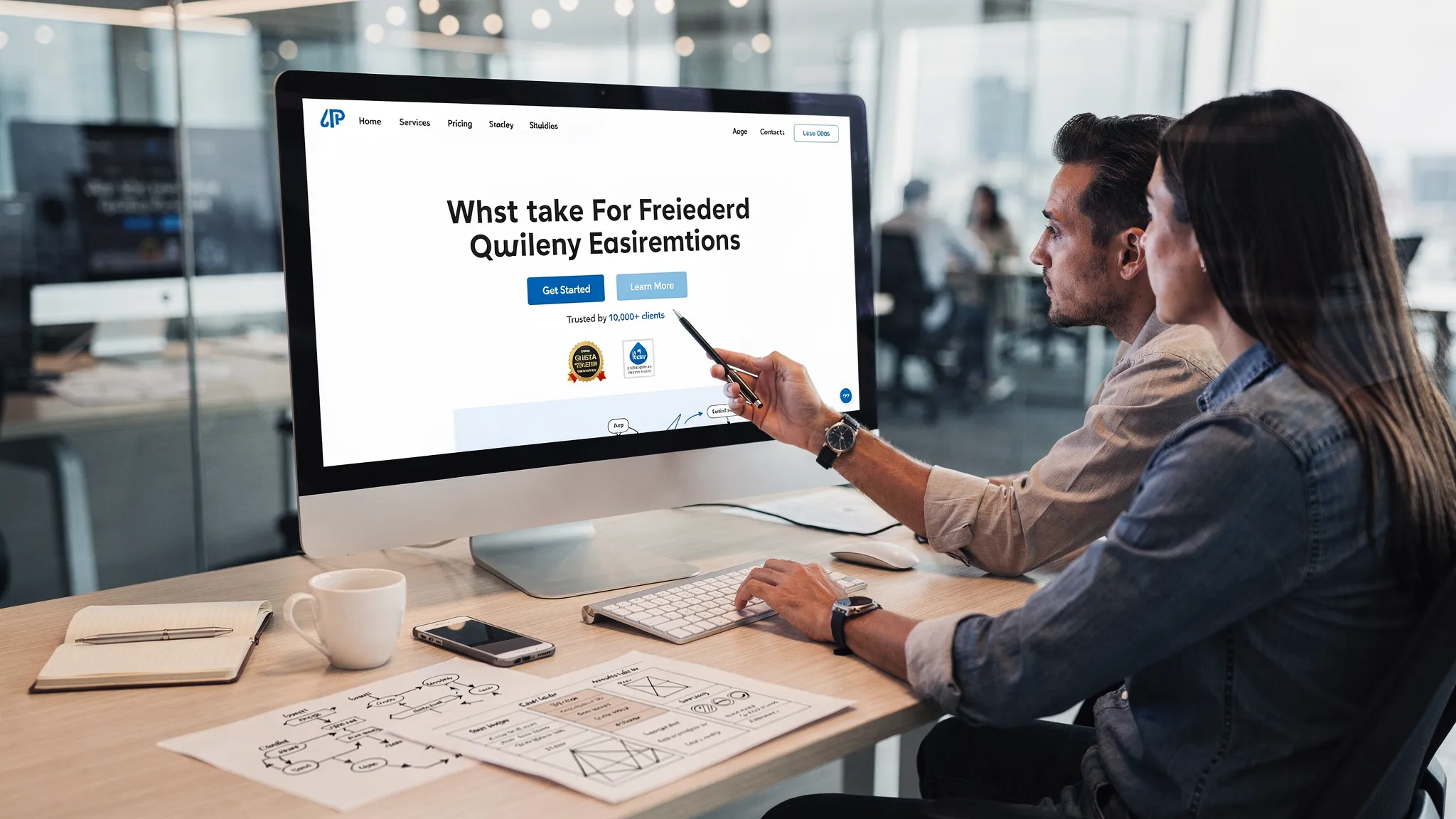
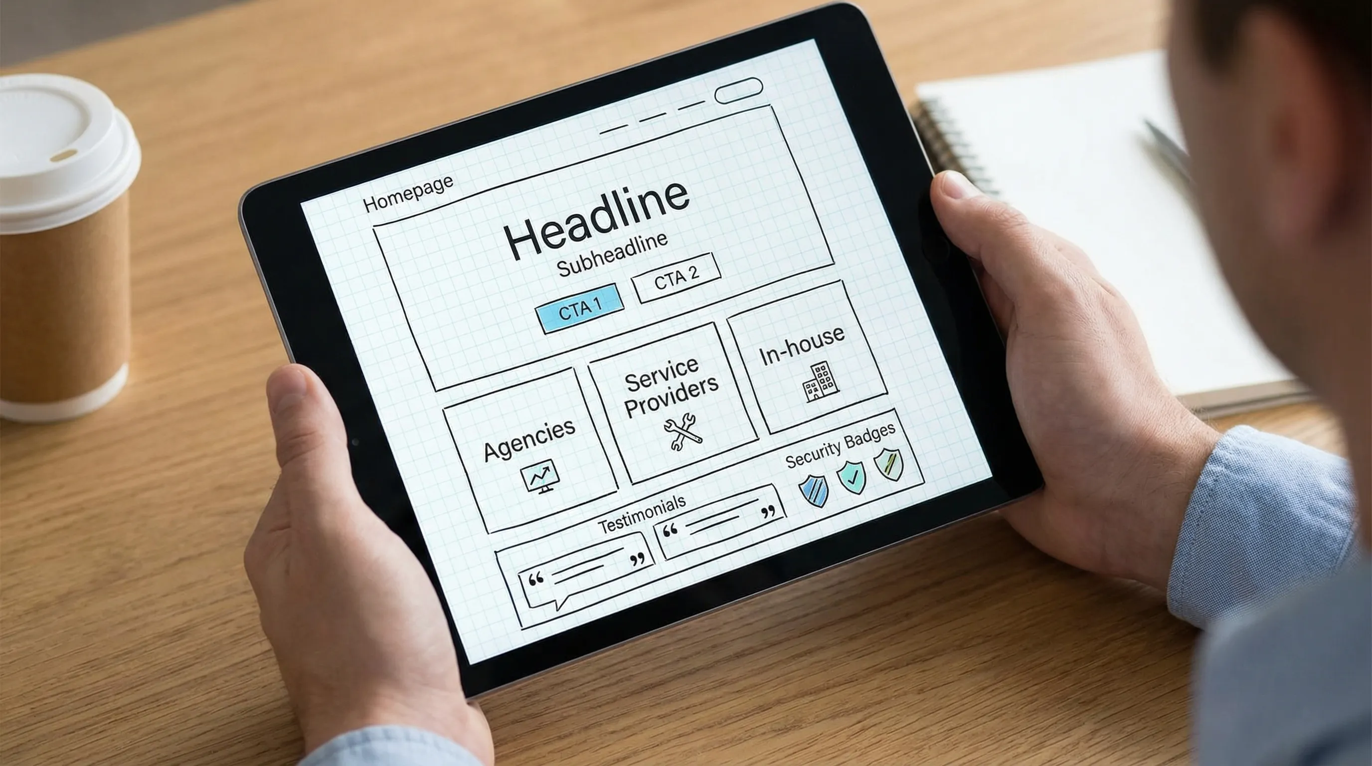
Homepage: the highest leverage page (but only if it routes correctly)
Your homepage should do three things quickly: clarify what you do, who you do it for, and what happens next.
What a converting homepage includes in 2026
1) One-sentence value proposition that names the outcome Avoid vague lines like “All-in-one growth platform.” Prefer outcome-forward language (time saved, risk reduced, revenue enabled).
2) Two CTAs: one for high intent, one for medium intent
- High intent: Book a demo
- Medium intent: Start free trial or See how it works
3) A “Who it’s for” router This can be simple: Agencies, service providers, in-house teams. The goal is to prevent the homepage from being a dead end.
4) Proof near the top, not buried Proof is not only logos. Strong proof includes:
- Specific outcomes (even directional, like “minutes instead of days”)
- Process proof (what you actually do)
- Risk proof (security posture, access model)
Product or “How it works” page: explain the mechanism, not the marketing
In 2026, the product page converts when it makes the mechanism feel inevitable.
Use this structure
Above the fold
- Outcome statement
- A short “mechanism line” (how you achieve it)
- Primary CTA
Middle of page
- The workflow, step by step
- What the customer must provide (IDs, permissions, assets)
- What your system automates
Bottom of page
- Security and governance summary
- FAQs that address real blockers
- Secondary CTA
For example, Connexify’s core story is operational: a single branded onboarding link that streamlines secure, multi-platform access setup and eliminates manual back-and-forth. When you present a mechanism like that, show it as a workflow, not a paragraph.
Use case pages: where generic features turn into “this is for us”
Use case pages convert best when they focus on a specific moment of pain.
Strong use case angles for agencies and service providers include:
- “Client access setup in minutes, not days”
- “Standardize permissions across platforms”
- “Launch-ready onboarding for paid media”
- “Client onboarding for multi-location brands”
What to include (to make them persuasive)
- Starting state: what’s chaotic today
- Required inputs: what you need from the client
- Definition of done: what “ready” means (access verified, tracking verified, approvals captured)
- Time-to-value: realistic timeboxes (avoid hype)
Pricing page: qualify the buyer and reduce “hidden cost” fear
Even when you cannot publish exact prices (or choose not to), you can still run a high-converting pricing page.
Pricing page elements that convert in 2026
1) Packaging clarity Spell out:
- Who each plan is for
- What is included (and what is not)
- What “setup” looks like
2) Risk reducers Examples:
- Free trial (Connexify offers a 14-day free trial)
- Clear cancellation language (only state what is true for your business)
- Security and data handling summary with a link to the full policy
3) A cost comparison that respects reality Instead of “Save $100k,” show where time and errors disappear (manual access chasing, permission mistakes, delayed launches).
Demo page: treat it like a product page for the call
In 2026, a demo page converts when it removes anxiety and ambiguity.
What to put on the demo page
- Who the demo is for (and who it is not for)
- What you will cover (a short agenda)
- What to bring (example: list of platforms, current process)
- What happens after (trial, proposal, implementation)
Form tips that consistently lift conversion:
- Ask fewer questions upfront
- Move qualification to the calendar confirmation or the first 2 minutes of the call
- Add a privacy note under the form (especially if you ask for phone)
Case studies: show constraints and implementation, not just outcomes
Many case studies fail because they read like victory laps. In 2026, the best ones are operational and specific.
A strong case study answers:
- What was broken (the real workflow problem)
- Why it was hard (constraints: tools, permissions, client responsiveness)
- What changed (new process)
- What improved (time-to-launch, fewer errors, fewer meetings)
If you sell onboarding and access automation, implementation details are not “too much.” They are the reason a skeptical buyer believes you.
Security and trust pages: conversion assets, not legal checkboxes
Security is now part of marketing for any tool that touches client accounts, permissions, or data.
Your trust section should make it easy for a buyer to forward internally. Include:
- Plain-English summary of how access is handled
- Data handling principles (what you store, what you do not)
- Permissioning approach (least privilege is the direction many buyers expect)
- Links to privacy policy and terms
If you need support around implementation or information security projects beyond your in-house capacity, it can help to collaborate with an experienced consultancy like Syneo’s IT and AI solutions team for systems work (ERP/CMS/CRM), delivery support, and security-focused execution.
Integrations page: sell “fits our stack” before the first call
An integrations page converts when it prevents the objection: “This looks nice, but will it work with what we already use?”
What to include:
- Platforms supported (be precise)
- Integration methods you support (for example, API and webhooks if applicable)
- What the integration enables (handoffs, automation, visibility)
Avoid vague badges like “works with 1,000+ tools” unless you can explain how and what that means in practice.
Comparison pages: capture high-intent evaluation traffic
Comparison pages are one of the highest intent assets in 2026 because buyers actively search “Tool A vs Tool B.”
A converting comparison page is:
- Specific about who wins for which use case
- Honest about limitations
- Structured around buyer criteria (time-to-value, security, platform coverage, permissions, branding)
If you are uncomfortable naming competitors, you can still build comparisons like:
- “Manual onboarding vs automated onboarding”
- “Generic forms vs branded onboarding links”
- “Password sharing vs scoped access workflows”
Onboarding or “Getting started” page: the overlooked closer
For agency-facing products, onboarding content is often what closes the deal.
Why: your buyer is picturing the first week after purchase, not the feature list.
A converting onboarding page includes:
- A realistic “Day 0 to Day 7” timeline
- What the client must do (and how long it takes)
- What you automate
- How you verify access and readiness
This is also where Connexify’s positioning is naturally strong: reducing onboarding time from days to seconds by centralizing secure setup through one branded link (without requiring installation).
Measurement: what to track so you can actually improve conversions
Conversion work is not a redesign, it is a loop.
Minimum viable measurement for a B2B marketing website
Track these events across your site:
- Demo: view, start form, submit
- Trial: start, activation milestone (first key action), conversion to sales call
- Pricing: page view, CTA click
- Case study: view, CTA click
- Comparison: view, CTA click
Common 2026 mistake: treating “traffic up” as success while demo-to-qualified rates fall. Instrument the journey end-to-end.
Quick audit checklist: is your site built to convert in 2026?
Use this as a fast gut-check.
- Your homepage states outcome + audience in one screen
- Every core page has one primary CTA (not five)
- Pricing answers “what’s included” and “what happens next”
- Security and data handling are easy to find
- Case studies include constraints and implementation details
- Integrations are specific (platforms + methods)
- Onboarding is explained with a realistic timeline
- You measure demo/trial conversions and drop-offs, not just visits
Frequently Asked Questions
What pages does a marketing digital website need to convert in 2026? A conversion-ready site typically includes a strong homepage, product/solution page, pricing, demo or trial page, case studies, security/trust, integrations, and an onboarding/getting started page.
Should I publish pricing on my website in 2026? If your market expects it, publishing pricing or clear packages can increase qualified leads. If you cannot publish exact numbers, provide ranges, inclusions, and next-step clarity to reduce uncertainty.
What is the most important conversion page for B2B SaaS or agency services? Usually the homepage and demo page, but pricing, security, and onboarding pages often decide the deal during internal review.
How do I make my demo page convert better? Reduce form friction, explain what the call covers, set expectations for next steps, and add proof near the form (short testimonials, outcomes, or a simple agenda).
Why does an onboarding page increase conversions? It reduces perceived risk by showing how fast someone can get to value, what the process requires, and how implementation is handled.
Build a faster path from “yes” to launch
If your website is doing its job, the next bottleneck is usually onboarding: collecting access, permissions, and platform setup without weeks of back-and-forth.
Connexify helps agencies and service providers streamline that step with a single, branded onboarding link that supports multiple platforms, customizable permissions, and secure handling, with no installation required.
- Explore Connexify at connexify.io
- Or move straight to a conversation and book a demo (and if you prefer to test first, there is a 14-day free trial)